How to Choose Yarn Color Combinations
Choosing the right yarn color combinations can greatly influence the overall aesthetic of your knitting or crochet project. With an overwhelming variety of colors available, selecting the perfect palette may seem daunting.
This guide aims to simplify the process of how to choose yarn color combinations. Whether you’re working on a cozy blanket, a stylish sweater, or vibrant accessories, understanding the principles of color theory and personal preference can inspire creativity and lead to stunning results. Let’s explore the world of yarn colors and how to make choices that truly reflect your vision.
Importance of Yarn Color Selection
The selection of yarn color is not merely a matter of preference; it significantly impacts the emotional response and visual appeal of your project. Colors can evoke various feelings and set the tone for your work. For instance, warm colors like reds and oranges often create a sense of energy and warmth, while cooler tones such as blues and greens tend to convey tranquility and calmness. Additionally, the effective use of contrast and harmony can enhance texture and depth, making your piece more engaging.
Moreover, the right color combination can transform a simple design into a breathtaking masterpiece, allowing your creativity to shine through and resonate with those who experience your creation. Therefore, taking the time to thoughtfully consider your yarn color selection can be the key to achieving aesthetically pleasing and emotionally impactful results.
Understanding Color Theory
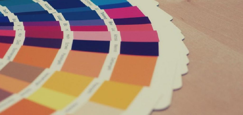
Understanding color theory is fundamental when selecting yarn color combinations, as it provides a framework for making informed decisions that can elevate your projects. At its core, color theory involves the relationship between colors and how they can interact to create appealing designs. The color wheel, a classic tool in this theory, illustrates the primary, secondary, and tertiary colors and their positions relative to one another.
By exploring concepts such as complementary colors—those that sit opposite each other on the wheel—and analogous colors—those that are next to each other—you can create dynamic contrasts or harmonious blends in your work. Furthermore, considering the properties of colors, such as hue, saturation, and brightness, allows you to select shades that not only fit your vision but also evoke the desired emotional response. Implementing these principles in your yarn selection can enhance the depth and complexity of your projects, leading to truly stunning results.
10 Methods How to Choose Yarn Color Combinations
1. Understand the Color Wheel
The color wheel is an essential tool for selecting harmonious yarn color combinations. It displays primary, secondary, and tertiary colors and their relationships to each other. To use the color wheel effectively, start by identifying the main color you want to work with. Then, explore complementary colors (those opposite each other on the wheel) for high contrast, or analogous colors (those next to each other) for a more harmonious look.
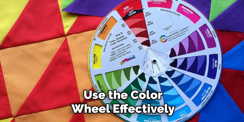
For example, if you choose a blue yarn, its complementary color is orange, while analogous colors include green and purple. Understanding these relationships helps you create balanced and visually pleasing color combinations.
2. Use a Monochromatic Scheme
A monochromatic color scheme involves using different shades and tints of a single color. This method is ideal for creating a cohesive and subtle color combination. To implement this scheme, select a base color and then choose yarns in lighter and darker shades of that color. For example, if your base color is teal, you might select lighter aqua and darker navy yarns.
This approach ensures that all colors blend seamlessly, creating a sophisticated and elegant effect. Monochromatic schemes are particularly effective for projects where a unified look is desired, such as shawls, blankets, or garments.
3. Experiment with Contrast
Contrasting colors can add dynamic visual interest to your projects. To create contrast, choose colors that are opposite each other on the color wheel, such as blue and orange or purple and yellow. High contrast color combinations draw attention and can make patterns stand out. For instance, a scarf with bold contrasting colors will be eye-catching and vibrant. When experimenting with contrast, consider the intensity of the colors—using equally intense shades will provide a stronger contrast, while combining lighter or more subdued tones can create a more subtle effect.
4. Consider the Project Type
The type of project you’re working on can influence your choice of yarn color combinations. For example, if you’re making a baby blanket, you might opt for soft, soothing colors or pastels that evoke a sense of calm. On the other hand, if you’re designing a statement piece like a sweater or shawl, you may choose bolder colors or high-contrast combinations to make a fashion statement. Understanding the purpose and intended use of your project helps guide your color choices, ensuring that they align with the project’s overall aesthetic and function.

5. Draw Inspiration from Nature
Nature provides a wealth of inspiration for color combinations. Look at natural landscapes, flowers, or even seasonal changes to find beautiful and harmonious color palettes. For example, the colors of a sunset might inspire a combination of warm oranges, pinks, and purples, while a forest scene could suggest deep greens, browns, and earthy tones.
You can use nature-inspired palettes to evoke specific moods or themes in your projects. To capture these colors, consider taking photos during your outdoor walks or exploring botanical gardens for visual inspiration.
6. Use Color Theory Tools
Several online tools and apps are available to help you choose color combinations based on color theory. Websites like Adobe Color Wheel, Coolors, and Color Hunt allow you to experiment with different color schemes and see how various colors interact with each other. These tools often provide options for creating complementary, analogous, or triadic color schemes, and can be invaluable for visualizing how colors will work together before committing to your yarn choices.
By utilizing these digital resources, you can create well-thought-out color combinations with ease.
7. Incorporate Patterns and Stripes
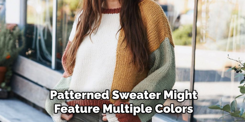
When selecting yarn colors for projects with patterns or stripes, it’s essential to consider how the colors will interact within the design. Choose colors that complement or contrast well with each other to enhance the pattern’s visual appeal. For instance, a striped blanket might use alternating colors to create a bold effect, while a patterned sweater might feature multiple colors to highlight different sections of the design. When working with patterns, swatch your colors together to see how they look in combination and ensure they achieve the desired effect.
8. Test Color Combinations with Swatches
Testing color combinations with swatches is a practical way to see how colors work together in your chosen yarn. Create small swatches using the colors you are considering and observe how they interact. Pay attention to how the colors look in different lighting conditions and how they change when placed next to each other. Swatching allows you to assess the overall harmony of your color choices and make adjustments as needed before starting your main project. This step helps prevent any surprises and ensures that the final result meets your expectations.
9. Consider the Yarn Texture
The texture of the yarn can influence how colors appear when combined. For example, a fuzzy or textured yarn may soften the contrast between colors, while a smooth, shiny yarn may enhance the color vibrancy. Consider how the yarn’s texture will affect the overall look of your project and choose colors that complement the texture. If you’re using a textured yarn, opt for colors that work well with its unique characteristics and create the desired visual effect. Understanding how texture interacts with color helps you make informed decisions and achieve a polished result.
10. Personal Preferences and Trends
Ultimately, your personal preferences and current trends play a significant role in choosing yarn color combinations. Consider colors that resonate with your individual style and preferences, as well as any current color trends that inspire you. Whether you prefer classic neutrals, bold and vibrant hues, or soft pastels, choose colors that you love and will enjoy working with. Stay updated on color trends by exploring fashion magazines, design blogs, or social media to find inspiration and incorporate contemporary color choices into your projects.
Common Mistakes to Avoid
When selecting yarn color combinations, it’s important to be mindful of certain pitfalls that can detract from your project’s overall success. One common mistake is relying solely on trends without considering personal preference; while trendy colors can be appealing, choosing shades that resonate with your own style will lead to more satisfying results.
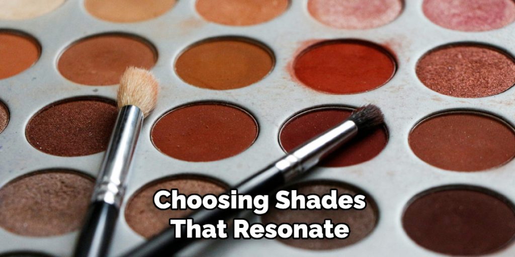
Another frequent error is neglecting to swatch; failing to test color combinations can result in unexpected clashes and disappointment when the project is completed. Additionally, overlooking the influence of lighting can mislead your color choices, as colors can appear differently in natural light versus artificial light.
Conclusion
Choosing yarn color combinations is both an art and a science, involving a thoughtful approach to blending hues and creating visually appealing designs. Hopefully, this article gave you some helpful tips about how to choose yarn color combinations successfully, so now that you have the proper knowledge on how to get the job done, why not give it a try today?


