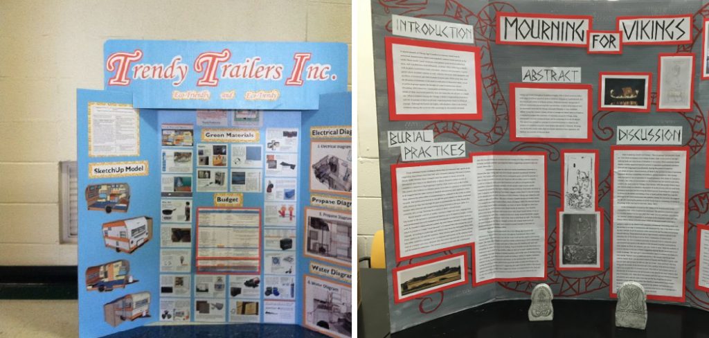
How to Decorate a Poster Board
Decorating a poster board offers a blank canvas for unleashing your creativity and showcasing your ideas in a visually captivating way.

Whether you’re working on a school project, creating a presentation, or designing a poster for an event, the possibilities for decorating poster boards are endless.
From colorful drawings and eye-catching graphics to intricate designs and mixed media collages, decorating a poster board allows you to convey your message with style and flair. In this article, we’ll explore various techniques and ideas for how to decorate a poster board, including tips for choosing the right materials, layout, and design elements.
Whether you’re a seasoned artist or a novice crafter, mastering the art of poster board decoration will undoubtedly enhance your presentations and make your ideas stand out from the crowd.
So grab your supplies and get ready to transform your poster board into a work of art that commands attention and leaves a lasting impression.
The Importance of Poster Boards for Various Purposes
Poster boards serve as an essential tool in various fields, embodying a versatile medium for communication, education, and expression. In educational settings, they are invaluable for facilitating learning and creativity.

Students use poster boards to present research findings, visualize complex ideas, and showcase their projects, making learning interactive and engaging. In the business realm, poster boards are pivotal in marketing strategies.
They provide a tangible way to present information, promote products, or communicate a brand’s message at conventions, meetings, and in-store displays.
Furthermore, in artistic and community events, poster boards become canvases for artists and activists to express ideas, advocate for causes, and connect with the audience. The utility of poster boards across these varied domains highlights their significance in effectively conveying messages and fostering visual communication.
The Benefits of Decorating Poster Boards
Decorating poster boards not only enhances the aesthetic appeal of your presentation but also offers several key benefits that can significantly impact the effectiveness of your communication.
A well-decorated poster board grabs attention, making your message more visible and engaging to your audience. It provides a visual context that aids in understanding complex information more easily, breaking down barriers to communication.
Creatively decorated poster boards can also stimulate interest and curiosity, encouraging viewers to take a closer look and absorb the details of your message. Furthermore, the process of decorating allows for personal or brand expression, enabling you to convey your unique style and values in a visual format.
In educational settings, decorating poster boards fosters creativity and hands-on learning among students, promoting engagement and enhancing memory retention. In marketing, a visually compelling poster can differentiate your product or service in a crowded marketplace, creating a memorable brand experience.
Overall, the benefits of decorating poster boards extend beyond mere aesthetics, impacting both the presenter and the audience by improving communication, engagement, and expression.
Brainstorming Ideas and Themes for the Poster Board
Before diving into the actual decoration of your poster board, it’s crucial to engage in brainstorming to generate ideas and settle on a theme that best conveys your message.

Start by clarifying the purpose of your poster board – Is it educational, promotional, or purely artistic? Once the purpose is clear, consider the audience you aim to attract and what themes might resonate with them the most.
For educational projects, themes can vary from historical events, scientific concepts, to literary analyses, focusing on creating an informative yet visually appealing presentation.
For marketing purposes, the theme should align with your brand identity and the message you want to convey, using colors, images, and designs that reflect your product or service. Artistic and community posters offer the freedom to explore more creative and abstract themes, such as social justice issues, cultural celebrations, or personal artistic expressions.
To generate ideas, organize a brainstorming session where you can jot down all thoughts without judging them initially. Look for inspiration in magazines, online platforms, art galleries, or your surroundings.
Think about the emotions you wish to evoke in your audience, and select colors, images, and fonts that align with those feelings. Consider incorporating elements that make your poster stand out, such as interactive features, 3D objects, or technology.
Once you have a broad range of ideas, narrow them down by considering the feasibility, the resources available, and the potential impact on the audience. Your chosen theme should not only be visually compelling but should also accurately represent the information or message you wish to share, ensuring that your poster board is both engaging and effective.
Sketching Out a Rough Layout or Design Plan

Once you’ve solidified your theme and amassed a collection of ideas, the next critical step is sketching out a rough layout or design plan for your poster board. This preliminary sketch will serve as a blueprint for your final creation, allowing you to experiment with the arrangement of elements before committing to the full-scale decoration.
Start by considering the size and orientation of your poster board – will it be portrait or landscape? This can significantly influence the distribution of your content and the overall impact of your design.
To begin, lightly draw a grid on your poster board as a guideline. This grid can help you align elements symmetrically and manage space more effectively.
Then, outline the areas designated for the title, images, texts, and any other components central to your theme. Think about the flow of information – you’ll want to guide the viewer’s eye smoothly from one element to the next, creating a coherent and engaging narrative.
Play with different fonts and sizes for your headlines or key points to see what captures attention while maintaining readability.
Consider how you’ll incorporate color – whether it’s through backgrounds, text, or images, and how it ties into your theme’s emotions or brand identity. Remember, the layout mustn’t only be visually appealing but also functional, allowing your audience to grasp the essence of your message quickly.
This phase is about exploration and adjustment, so don’t hesitate to redraw or rearrange components on your sketch until you find a balance that feels right. Once satisfied with your rough layout, you’ve effectively created a roadmap that will guide the more detailed decoration process, helping to ensure that your final poster is both beautiful and impactful.
Choosing the Right Poster Board

Selecting the appropriate poster board is a foundational step in ensuring the success of your project. The right poster board not only serves as the canvas for your creative expression but also influences the durability, presentation, and overall impact of your work. When choosing a poster board, consider the following key factors:
- Material: Poster boards come in various materials, from traditional cardboard to foam core and even plastic sheets. The choice of material depends on the intended use and location of your poster. For instance, foam core boards are lightweight yet sturdy, making them ideal for presentations that require a professional look. Plastic sheets, on the other hand, offer durability and water resistance, perfect for outdoor displays.
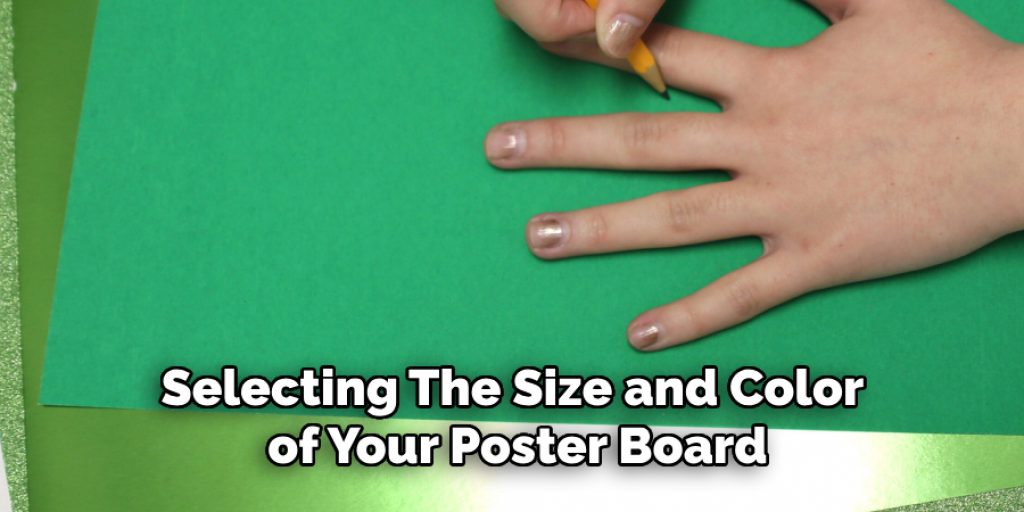
- Size: The size of your poster board should align with the scope of your project and the amount of information you need to convey. Standard sizes are available, but custom sizes can be cut to suit more specific needs. Ensure the size you choose is manageable and fits within the display area allocated for your poster.
- Color: While white is classic and offers a blank canvas, colored poster boards can add an extra layer of interest and help underscore your theme. Consider the color psychology and how certain hues can evoke specific emotions or highlight your content effectively.
- Finish: The finish of your poster board – matte, glossy, or semi-gloss – can affect the visibility of your message. A matte finish is preferable in brightly lit environments to reduce glare, while a glossy finish might be chosen for its vibrant color presentation in softer lighting conditions.
- Environmental Impact: For those concerned with sustainability, look for poster boards made from recycled materials or those that are recyclable. This choice reflects not only on the quality of your presentation but also on your commitment to environmental responsibility.
Tips for Choosing the Appropriate Size and Color

When selecting the size and color of your poster board, these tips can help you make an informed decision that aligns with your project goals and audience engagement strategy:
- Assess the Venue and Audience Distance: The size of your poster board should be appropriate for the viewing distance. Larger boards are optimal for venues where viewers will be standing further away, ensuring that text and visual elements are easily legible from a distance. Conversely, a smaller board suffices for close-up interactions, such as tabletop presentations or displays.
- Consider the Amount of Content: Align the size of your poster board with the volume of content you plan to display. Crowding too much information onto a small board can overwhelm your audience, while too large a board with scant content may appear sparse. Aim for a balanced aesthetic that allows each element to breathe.
- Use Color Strategically: Choose a color that complements your theme and enhances readability. Bright colors can attract attention but may not always suit dense text or detailed imagery. A colored background can set the mood or highlight specific sections, but ensure there’s sufficient contrast between the background color and text for clarity. Neutral or pastel backgrounds with bold colored text can be effective for clarity and visual impact.
- Understand the Psychology of Color: Different colors can evoke different emotional responses. For example, blue can convey trust and calmness, making it suitable for professional or educational topics, whereas red can symbolize energy and urgency, ideal for attention-grabbing headlines. Tailor your color choices to the psychological impact you wish to achieve.
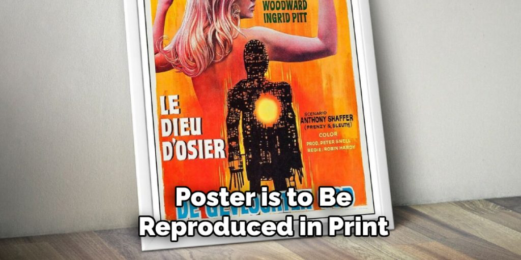
- Adaptability for Reproduction: If your poster is to be reproduced in print or digital formats, consider how the size and color choices will translate. Some colors may not print as vibrantly as they appear on screen, and size dimensions may need adjustments for different formats. Test your color choices and layout in various mediums to ensure consistency and effectiveness.

10 Methods How to Decorate a Poster Board
01.Plan Your Design:
Start by planning your design before you begin decorating the poster board. Consider the purpose of the poster board and the message you want to convey. Sketch out your ideas on paper or digitally to visualize the layout and organization of content.
02.Choose a Color Scheme:
Select a color scheme that complements your content and enhances readability. Choose colors that contrast well and draw attention to key points. Consider using a combination of colors to create visual interest and hierarchy.
03.Add Text and Graphics:
Incorporate text and graphics to convey your message effectively. Use clear and concise language for your text, and choose fonts that are easy to read from a distance. Include graphics, images, and icons to enhance visual appeal and illustrate your points.
04.Create Borders and Frames:
Define the edges of your poster board by creating borders and frames. Use colored paper, washi tape, or markers to create borders that complement your design. Add decorative elements such as patterns or shapes to enhance the borders and frames.
05.Use Dimensional Elements:
Add dimension to your poster board by incorporating dimensional elements. Use foam board, cardboard, or craft foam to create raised or layered elements that add texture and depth to your design. Attach dimensional elements securely to ensure they withstand handling and transportation.
06.Add Embellishments:
Enhance your design with embellishments such as stickers, sequins, or rhinestones. Use metallic or glitter accents to add sparkle and visual interest. Be strategic with embellishments, using them sparingly to avoid overwhelming the overall design.

07.Incorporate Interactive Elements:
Engage viewers with interactive elements such as pockets, flaps, or QR codes. Add features that allow viewers to interact with your content or access additional information. Ensure interactive elements are user-friendly and enhance the overall experience.
08.Experiment with Mixed Media:
Get creative by experimenting with mixed media to add variety and interest to your poster board. Combine different materials such as paper, fabric, and found objects to create unique textures and effects. Incorporate techniques such as collage, painting, or stamping to add depth and dimension.
09.Tell a Story:
Use your poster board to tell a story or convey a narrative. Organize your content in a logical sequence that guides viewers through the information. Use visuals such as timelines, flowcharts, or storyboards to illustrate key points and connections.
10.Review and Refine:
Finally, review and refine your design to ensure coherence and consistency. Check for spelling and grammar errors, and make any necessary adjustments to improve readability and clarity. Practice presenting your poster board to ensure you can effectively communicate your message to viewers.
Common Mistakes to Avoid
When creating a poster board presentation, it’s easy to fall into common pitfalls that can detract from your message and its impact. Here are key mistakes to avoid:
- Overloading with Information: A cluttered poster board overwhelms viewers and makes it difficult to absorb the key message. Focus on clarity and simplicity, prioritizing the most important information.
- Using Too Many Fonts: Stick to a maximum of two or three complementary fonts. Using too many fonts can make your poster look disorganized and compromise readability.
- Ignoring White Space: White space, or negative space, is crucial for a balanced and well-organized design. It helps to separate different elements and makes the poster easier to read.
- Poor Quality Images: Blurry or pixelated images can make your presentation appear unprofessional. Ensure all images and graphics are of high resolution and relevant to your content.
- Inconsistent Color Scheme: Choose a color scheme early in the design process and stick to it throughout the poster. Consistency in colors contributes to a cohesive and harmonious design.
- Neglecting Audience Engagement: Your poster should invite interaction. Avoid being too text-heavy or technical without considering ways to engage your audience, whether through questions, interactive elements, or compelling visuals.
- Forgetting Contact Information: If your poster is meant to promote, educate, or solicit feedback, forgetting to include contact information or next steps is a missed opportunity for further engagement.
By sidestepping these common errors, you can enhance the effectiveness of your poster board and ensure it serves its intended purpose with maximum impact.
Conclusion
In conclusion, decorating a poster board offers a versatile and dynamic way to express your creativity and communicate your message effectively.
Whether you’re using it for educational purposes, artistic endeavors, or promotional materials, the key is to let your imagination soar and experiment with different techniques and ideas.
By incorporating color, texture, and visual elements, you can create a poster board that not only captures attention but also conveys your message in a memorable and impactful way.
Whether you’re a student, professional, or hobbyist, mastering the art of poster board decoration opens up endless possibilities for sharing your ideas and showcasing your talents. Thanks for reading, and we hope this has given you some inspiration on how to decorate a poster board!


